Walk into almost any bookshop today, and you pass merchandise before you reach the fiction. Shirts on a rack near the window. Tote bags hanging behind the counter. Pins and patches in a tray by the till.
It is easy to read this as a recent commercial drift. It is not. Readers have been wearing and carrying their books for close to a century. Only the fabric changed.
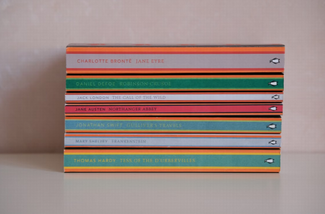
When a Cover Became a Signal
Penguin Books launched in 1935 with a practical problem to solve. Allen Lane wanted to sell serious literature cheaply to people who did not think of themselves as bookshop customers. The solution was partly editorial and mostly visual.
Edward Young designed a cover with no illustration at all. Two horizontal bands, clean type, and a small logo. Colour did the sorting work. Orange for fiction, green for crime, dark blue for biography.
The result was a book you could identify from across a room. That mattered for shop windows and shelf display. It also meant something the publisher may not have planned for. A paperback visible in a coat pocket told strangers what its owner was reading.
Design historians still teach those covers because the system was so economical. No illustration budget, no expensive printing. Just repetition, order, and instant recognition.
When a Design Becomes Property
Once a visual identity carries meaning, ownership of it becomes contested. Comics history offers the sharpest version of this. The people who draw an icon often end up with nothing while the image earns fortunes.
That fight sits at the centre of the Superman Wars review published here, which follows Jerry Siegel and Joe Shuster against the corporate machinery that outlived them both. The lesson carries over into publishing. A recognisable design is an asset, and assets attract claims.
From the Shelf to the Shoulder
The tote bag was the first real step off the page. Bookshops and libraries began printing canvas in the 1970s and 1980s, mostly as a practical way to carry hardbacks home. It turned into something else almost immediately.
A tote from a particular shop said where you had been. A library tote said what you funded. The bag was cheap to produce, useful daily, and readable at a glance. It did the same work Penguin’s orange bands had done, only in public rather than on a shelf.
Apparel followed the same logic. Readers who want a design that survives repeated washing can browse The Bookish Goods or the counter rack at a local shop, where bookish t-shirts and embroidered graphic tees carry the reading slogans and literary references that used to live on canvas. The medium shifted. The signal did not.
What the Shirt Actually Says
Not all bookish apparel does the same job. The designs sort into rough categories, and each one sends a different message to the people who read it.
Slogan shirts are the bluntest instrument. They state a preference and invite either agreement or argument. A shirt naming a genre or a trope works as a filter for conversation.
Place-based designs operate differently. A shirt printed with a bookshop name or a library building is closer to a souvenir. It records attendance rather than taste.
Then there are the quiet ones. A small embroidered word, no illustration, no joke, nothing legible from more than a few feet away. These are the closest descendants of the Penguin approach. Recognisable to people who already know, invisible to everyone else.
The category a design falls into matters more than the print quality. A loud slogan worn by someone who wants to be left alone is a mismatch. So is a subtle mark on a reader who was hoping to be asked about it.
The Genre Problem
There is one awkward split worth naming. Most bookish design is built around contemporary fiction, and readers of history, biography, and espionage rarely see themselves represented on a rack.
That is a market gap rather than a slight. The audience is smaller and harder to print a joke for. A shirt referencing a specific 1940s thriller writer will find perhaps eleven buyers, which is a poor basis for a production run.
The Habit Has Older Roots Than It Looks
The idea of a book as a portable marker of identity predates all of the merchandise. The clearest case came out of the Second World War, and it was built on necessity rather than commerce.
Between 1943 and 1947, American publishers and the military produced roughly 123 million paperbacks for free distribution to service members overseas. They were sized to fit a uniform pocket and printed to be read and discarded. Titles were drawn from classics, bestsellers, humour, and poetry.
The Library of Congress holds one of the few surviving complete sets and maintains a research guide to the Armed Services Editions for anyone tracing the origins of the American mass-market paperback. Those books did more than pass time in transit ships and field hospitals.
They also created a generation of readers who expected books to travel with them. A paperback in a uniform pocket was visible to everyone nearby. Other men saw the cover, recognised the title, and started talking. The book worked as a social object long before anyone thought to sell it as one.
Why Any of This Matters
Reading is solitary work with a social afterlife. You finish a novel alone, then spend the next fortnight wanting to talk about it with someone. Most of the machinery around books exists to close that gap.
Reviews do it. Clubs do it. So do forums, marginalia passed between friends, and the recommendation you press on a colleague who did not ask. Wearable design is one more attempt at the same problem.
It is a low-effort way of finding the people who have read what you have read, without having to open the conversation yourself. That is why the practice keeps resurfacing in new forms rather than fading out.
Colour-coded spines gave way to canvas bags, which gave way to printed cotton. The next version will look different again, and it will probably be dismissed as a novelty for a few years before anyone notices the pattern.
What stays constant underneath is the wish. Readers want their reading visible to the right people and unremarkable to everyone else. A good design manages both at once, which is far harder than it looks, and it explains why so few of them last.